

/
September 7, 2026

Responsive Web Design with HTML5 & CSS3

4.502
3 Enrolled

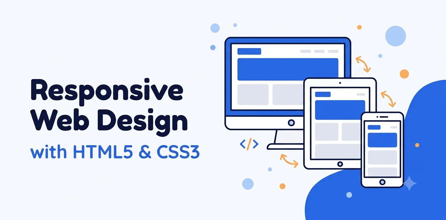
This course teaches you how to build professional, mobile-friendly websites using HTML5 and CSS3. From beginner to advanced concepts — semantic HTML, modern CSS layouts (Flexbox, Grid), media queries, and responsive design principles — everything is covered with practical, hands-on examples. By the end of this course, you’ll be able to design and code a fully responsive website that works perfectly across mobile, tablet, and desktop.

What Will I Learn?

  • Build fully responsive websites using HTML5 and CSS3
  • Use semantic HTML5 elements to structure web pages properly
  • Master CSS3 styling including box model, colors, and animations
  • Implement media queries and breakpoints for mobile, tablet, and desktop
  • Use Flexbox and CSS Grid to build modern, flexible layouts
  • Build a real-world responsive news website page from scratch

Course Content

An Introduction to This Course
This topic sets the stage for the entire course. It gives students a clear overview of what they will learn, how the course is structured, and helps them get their tools and environment ready before diving into actual coding.

HTML5 Fundamentals
This topic introduces students to HTML5's modern semantic tags and structural elements. It moves beyond basic HTML into more meaningful, accessible, and organized page structure, along with an introduction to forms and multimedia handling — key building blocks for any responsive website.

CSS3 Styling Basics
This topic covers the core CSS3 styling concepts that form the foundation of every website design. Students learn how elements are structured and spaced on a page, how to style them visually, and how to add simple motion effects — skills that are essential before moving into responsive layouts.

Introduction to Responsive Design
This topic introduces the concept of responsive design and why it's essential in today's multi-device world. Students understand the problems that arise without responsive techniques and learn the foundational tools needed to make a website adapt to different screen sizes.

Media Queries & Breakpoints
This topic teaches students how to use media queries to adapt a website's layout for different screen sizes. Building on the fluid layout basics from the previous topic, students learn to define specific breakpoints and apply them in a real, practical example.

Advanced CSS3 (Flexbox & Grid)
This topic covers modern CSS layout techniques — Flexbox and Grid — in detail. Students move beyond basic positioning and media queries into powerful, flexible layout systems that make building complex, responsive designs much easier and cleaner.

Coding a Responsive Design Web Page
This topic moves from theory into practice, guiding students through building a complete responsive webpage from scratch. Students apply everything learned so far — semantic HTML, CSS styling, Flexbox/Grid, and media queries — into one cohesive project.

Building a Sample Page for a News Site
This topic applies all previously learned skills through a real-world style project — building a responsive news website page. Students practice organizing content-heavy layouts and ensuring the design holds up across devices, simulating a real client scenario.

Future of Technology (Bonus/Wrap-up)
This final topic wraps up the course by looking ahead — introducing emerging trends in web design and pointing students toward their next steps in learning. It gives a sense of closure while motivating students to keep growing their skills beyond this course.

About the instructor

UX/UI and Visual Design specialist with experience in user research, interface design, prototyping, and design systems. Neha brings a practical approach to design education, helping learners turn creative ideas into user-friendly digital experiences.

4.50 (2 ratings)

3 Courses

1 students

Student Feedback

Excellent
1
Very Good
1
Average
0
Poor
0
Terrible
0
4.5
2 Reviews

This course is amazing, it is extremely thorough and in depth.

This course is amazing, it is extremely thorough and in depth.

Durations: 8 hours
Lectures: 27
Students: Max 110
Level: Beginner
Language: English
Certificate: Yes

Material Includes

  • 8+ hours on-demand video
  • 9 downloadable lesson resources
  • Full lifetime access
  • Access on mobile and desktop
  • Certificate of completion

Requirements

  • Basic computer knowledge (no prior coding experience required)
  • A code editor installed (e.g., VS Code) — free
  • A modern web browser (Chrome/Firefox) for testing
  • Willingness to practice coding along with lessons

Audience

  • Anyone who wants to learn web design from scratch
  • Beginners looking to start a career in front-end web development
  • Students who know basic HTML/CSS and want to learn responsive design
  • Freelancers who want to offer website design services to clients